A landing page is crucial to generate leads on your real estate website.
Without one, you may send paid traffic to your home page.
And this is like hunting for pigeons with a shotgun.
In other words, you will leave some money on the table and likely waste marketing dollars.
Want some inspiration on what type of real estate landing pages are out there?
Then, keep reading. I will cover five classic and five unique examples.
What Is a Real Estate Landing Page?
A real estate landing page is the entry point to a real estate marketing funnel (see my article about that topic here.
They can also be called real estate squeeze pages as a synonym.
You usually want to send targeted traffic to real estate landing pages.
You can do this with paid traffic (e.g., Google Ads) or through email campaigns and better test various versions.
The main elements to convert buyer and seller prospects are:
- A captivating headline
- Persuasive body copy
- Testimonials and other social proof elements (e.g., reviews)
- A mobile-friendly design
- A call to action (CTA)
However, using all or only some elements depends on the real estate landing page type.
What most definitely should have is a headline and a CTA (call to action).
5 Benefits of Using Real Estate Landing Pages
The main benefit of using real estate landing pages is targeted and optimized lead generation for your real estate business.
But there are secondary benefits, too:
- You can message in a more targeted way to a specific audience
- It’s easier to track and measure the effectiveness of a landing page
- They keep users more focused since they usually don’t have the usual navigation
- They can make A/B or split testing easier
As you can see, the secondary benefits all foster the main one: targeted and optimized lead generation.
Still not convinced about using real estate landing pages?
You may think, why not just design your real estate website in a way that captures leads on almost all pages?
That’s a bit tricky.
I have seen it on many real estate websites, meaning many leave money on the table.
Why it’s tricky?
You will not be able to simultaneously use the same marketing message for ice-cold, cold, warm, and hot prospects (see the type of real estate leads article) all over the place.
This may be done in a long-form direct-response sales letter where you bring a cold prospect to become a hot one.
But across several pages? No way.
Except, there is one option where it is possible.
That’s using an AI-powered chatbot that can tailor its message to the prospect’s awareness level across all pages.
By the way, the average real estate landing page conversion rate is 7.4%, and just contact form landing pages have a low conversion rate (source).
Overview of 10 Real Estate Landing Page Examples
We can get most of the traditional and unique real estate landing page examples when we look at the various real estate marketing funnels.
And when you study different real estate funnels, you may come up with even more types.
Let’s kick off with a short overview.
There are the following ones:
- Home search landing pages
- Free real estate tool landing pages
- Real estate lead magnet landing pages
- Single listing landing pages
- Real estate webinar landing pages
- Sales letter landing pages
- Video real estate landing pages
- Survey/ quiz landing pages
- Application landing pages
- Launch/Pre-Sell landing pages










No cookie-cutter real estate landing page type converts better than the next.
Anyone telling you otherwise would lie to you.
Why?
Conversion rates can vary widely based on numerous factors:
- Your target audience
- The landing page design elements
- The message-market-fit (how well you can communicate the offer on the landing page to the visitors’ wants and needs)
- The traffic sources you use
- The sellers’ and buyers’ awareness levels
What happens when your marketing message (your sales copy) matches well with the wants and needs of your seller or buyer prospect?
Your landing page will convert well, no matter the real estate landing page type.
Now, without further adieu, let’s get into the eleven real estate landing page types and examples, starting with the classic ones.
The 5 Classic Real Estate Landing Page Examples
You likely know most of this section’s real estate landing page examples already.
It’s the classic ones you mostly find across the web…
Home Search Landing Pages
These landing pages are the standard if you haven’t lived under a rock and mostly target buyer prospects.
Almost every agent and broker real estate website has them on their homepage.
It’s a landing page showcasing multiple listings on one page, allowing the prospect to search and browse through various listings.
Some use a search limit and ask the visitor for contact information to keep browsing or searching.
I’m a bit divided about this latter approach because you can mess it up easily in terms of the lead quality you get with that.
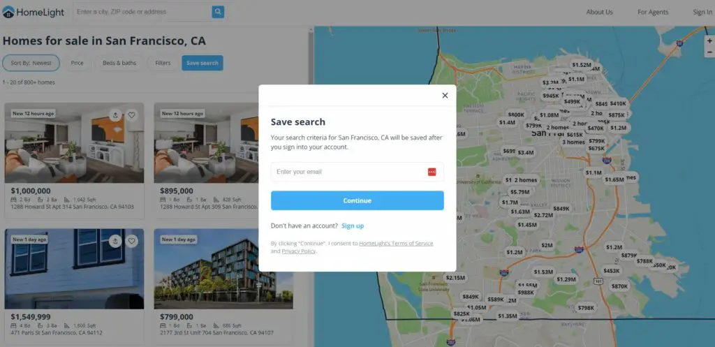
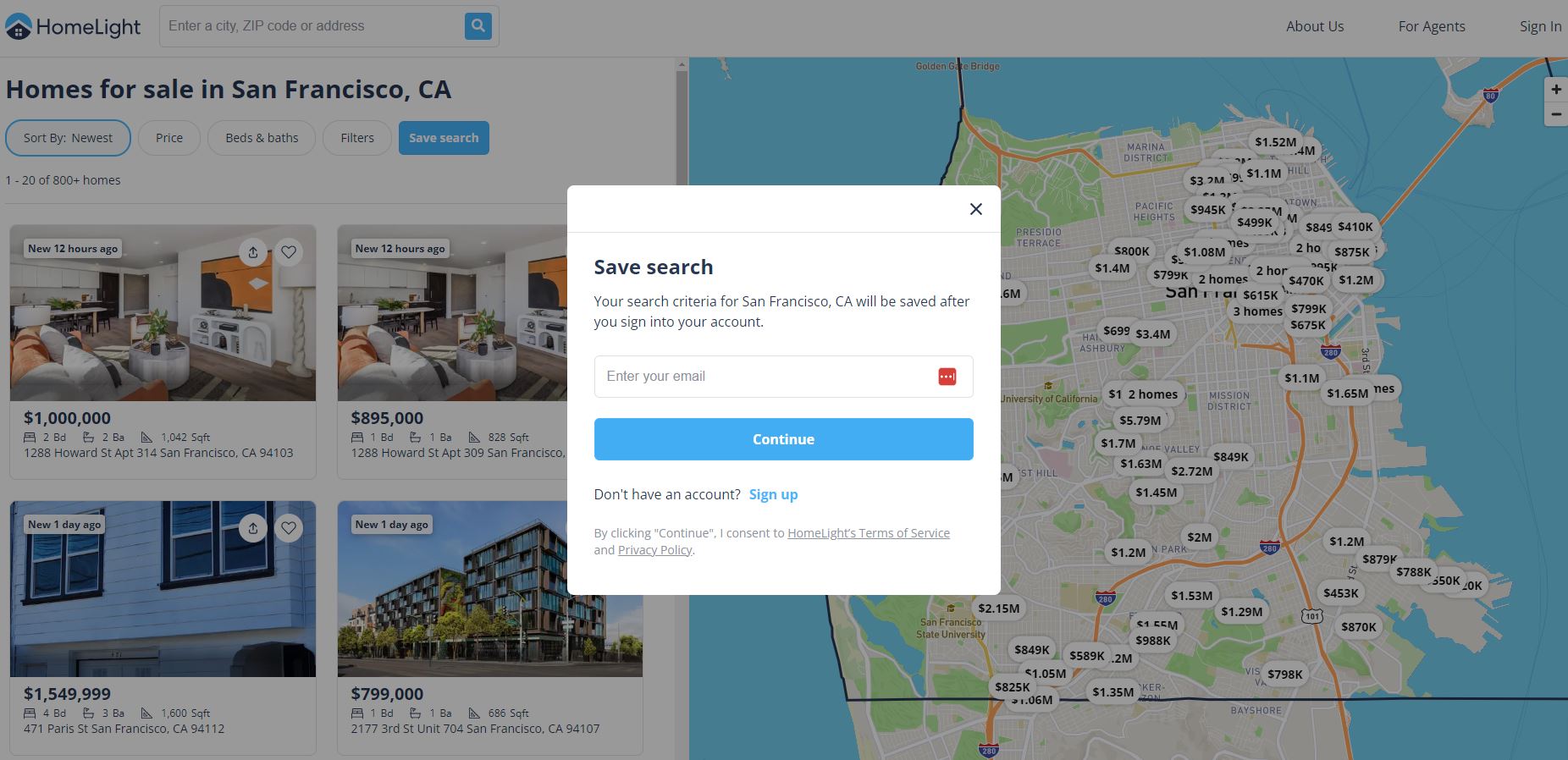
Homelight, which I discussed in this article, has a property search landing page.
It works like that.
You can search properties in different areas, and once you want to save your search, you are asked to enter your email address.
That’s the point of conversion.
Here is the landing page example from Homelight:
A Free Real Estate Tool Landing Page
This one aims to generate seller leads.
Over the years, I’ve encountered hundreds of broker and agent websites, and this is one landing page type you almost always find.
So, as the name indicates, it offers a free, useful tool (like a tax savings calculator, a home valuation tool, etc.).
The one I came across most is the free home valuation tool.
How does it work?
The seller prospect enters information about their property.
Then, they leave their contact data.
After that, the realtor returns with the property valuation.
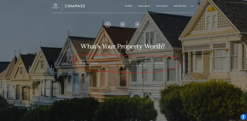
I found a nice example of such a landing page on this realtor’s website.
The design is light but elegant.
The button to start the valuation has enough contrast, and the opt-in is not too much in your face.
You can see for yourself below…

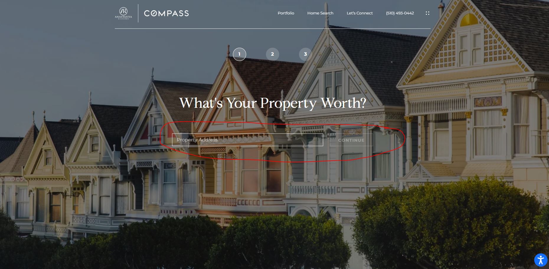
Using the wrong button color to get to the landing page is a common problem I’ve encountered.
Many use nice above-the-fold background auto-play videos.
Yet, the button color is often hardly visible because of the lack of contrast.
A real estate tool landing page should do the following:
- Clearly explain the tool’s benefits,
- Include a user and mobile-friendly interface
- Have a CTA for further real estate services
Real Estate Lead Magnet Landing Page
This real estate landing page type is also the most common and often used.
It is designed to provide something of value (like a guide or checklist) in exchange for contact details.
You can use it to target seller and/ or buyer prospects.
The lead magnet can be one of the following:
- A market report
- Buyer and seller guides
- Property inspection checklist
But there are many more lead magnet options if you check out my real estate lead magnet article.
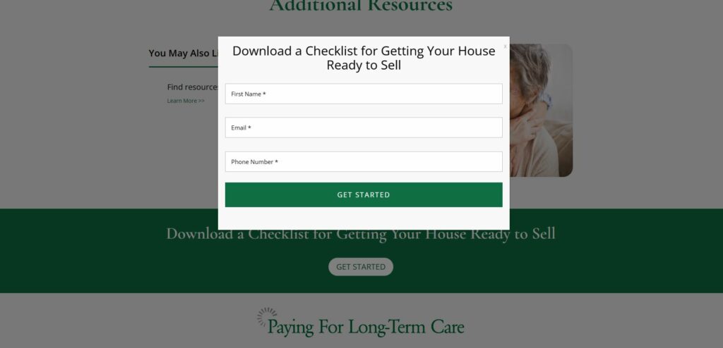
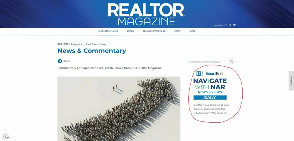
Check out the two examples below.
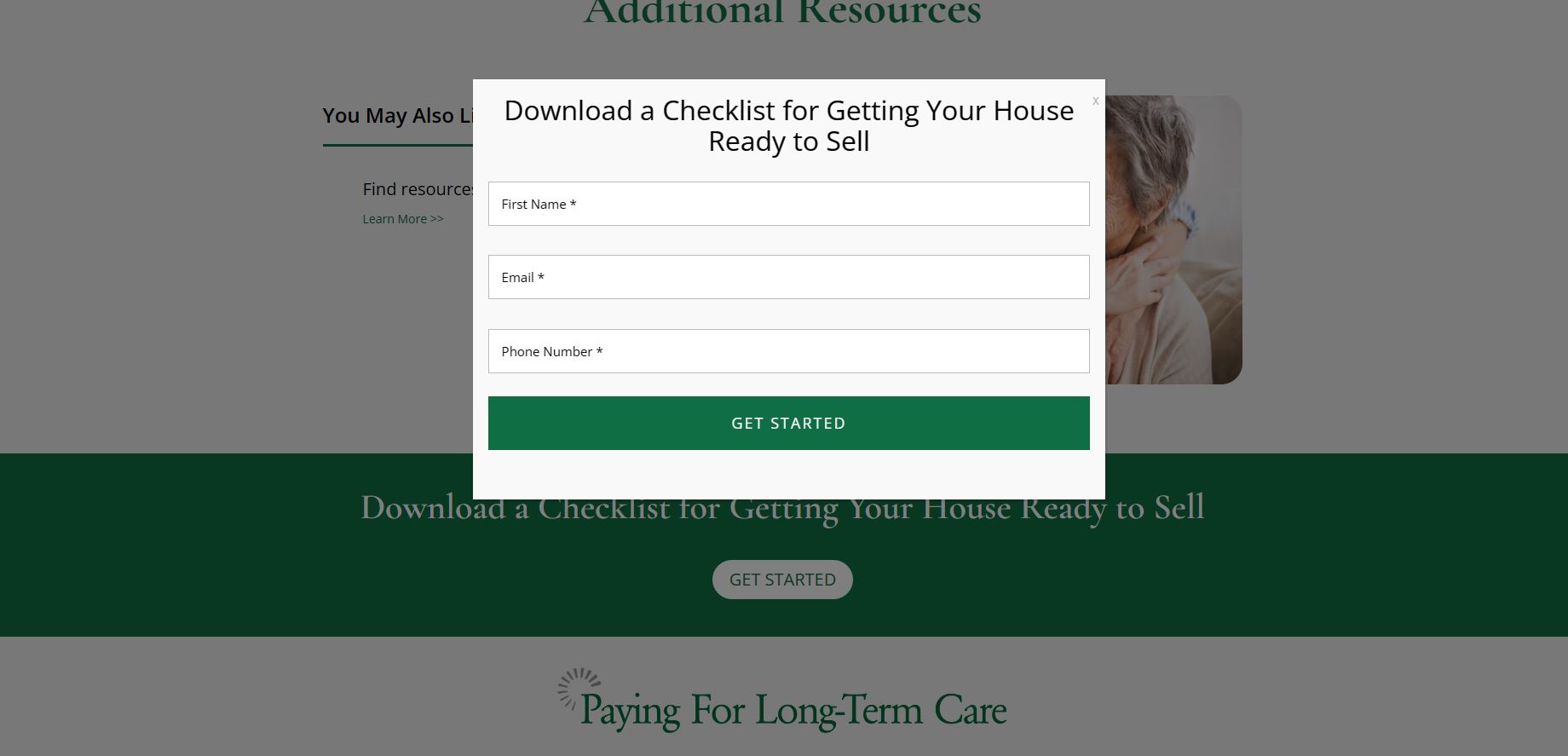
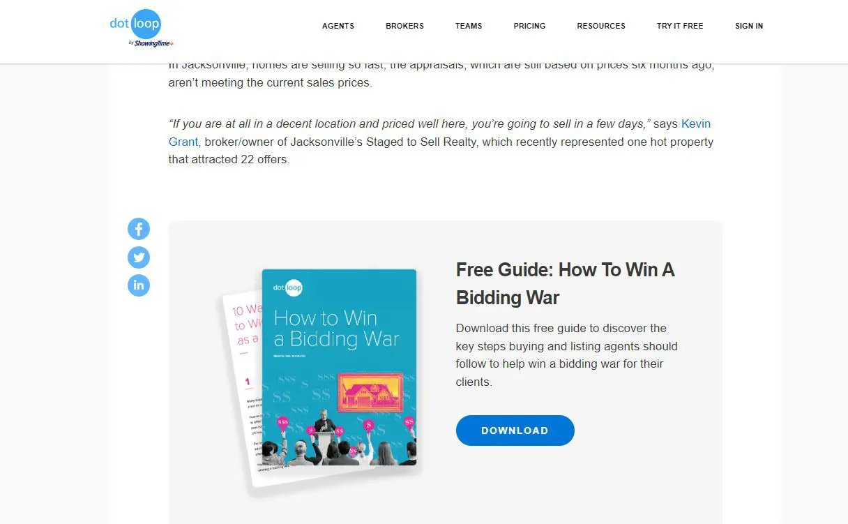
What I like about them is they don’t cause much friction because you don’t see the opt-in form first.
Only when you click on the button “Get Started” or “Download” will the form open.
However, the second one likely performs better regarding seller lead generation. It has a more benefit-driven headline.
Single Listing Landing Pages
You are likely also familiar with the single listing landing page.
It showcases a single property listing.
You can use it when you have an important property listing (e.g., an exclusive one) or when one listing needs extra marketing.
It is also more suitable when using various marketing channels (e.g., Instagram or Google ads) to funnel traffic to just this listing.
This approach will better help you track the traffic and conversions.
Here is a nice and clean example of a single listing landing page:
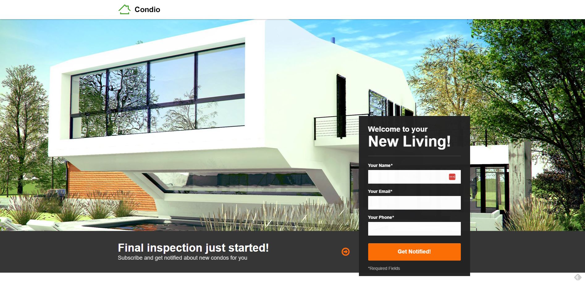
Using this real estate landing page type will also make it easier to use long-form sales copy.
Yes, when you click on one of the usual property listings, you may arrive at a single listing landing page.
However, the website’s design template will often limit you (often needs to integrate IDX). This means you can’t include additional persuasive elements.
In contrast, you have more freedom on a single listing landing page. So you could include all necessary elements of along-form direct-response sales letter.
Real Estate Webinar Landing Page
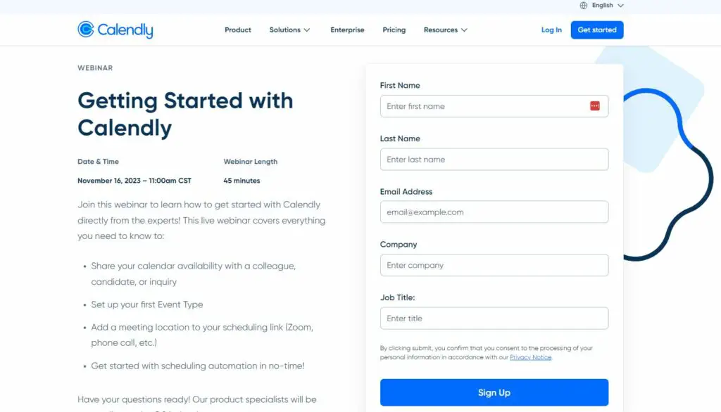
The real estate webinar landing page promotes an upcoming webinar.
It includes details about the webinar’s content, speaker information, and a registration form.
Webinars can be highly engaging. This can lead to reasonable conversion rates, especially if the topic is compelling.
One caveat and ninja-hack on a side note, though.
To avoid headaches with this type of landing page, firstly, don’t call them “webinars” (people have developed anti-bodies over the years).
Secondly, don’t make them live events to avoid waiting times at the start.
A webinar landing page looks like this:

5 Unique Real Estate Landing Page Examples
This section will teach you about six uncommon real estate landing page types and examples.
Why unique ones?
Well, just put yourself in a prospect’s shoes.
Let’s say you visit several real estate websites in a row.
And all use the same “home valuation” seller lead gen approach.
How will you stand out? Well, you won’t.
But the one who does something different will.
That’s why I wanted to mention the unique one.
So, let’s get going…
The Sales Letter Landing Page
This landing page typically includes the following:
- A compelling headline
- A persuasive lead and body copy
- The offer with testimonials
- A strong call-to-action (CTA)
- Additional persuasive elements.
It’s designed to introduce and sell an entry-level real estate product or service.
For instance, it can be first-time home buyer consultations, real estate ebooks, or guides.
But it could also be used to “sell” an appointment in a more exclusive context.
This type of landing page can effectively target new prospects with less knowledge of the market and a lower awareness level.
In other words, depending on your copywriting strategy, you could turn a cold prospect into a warm one.
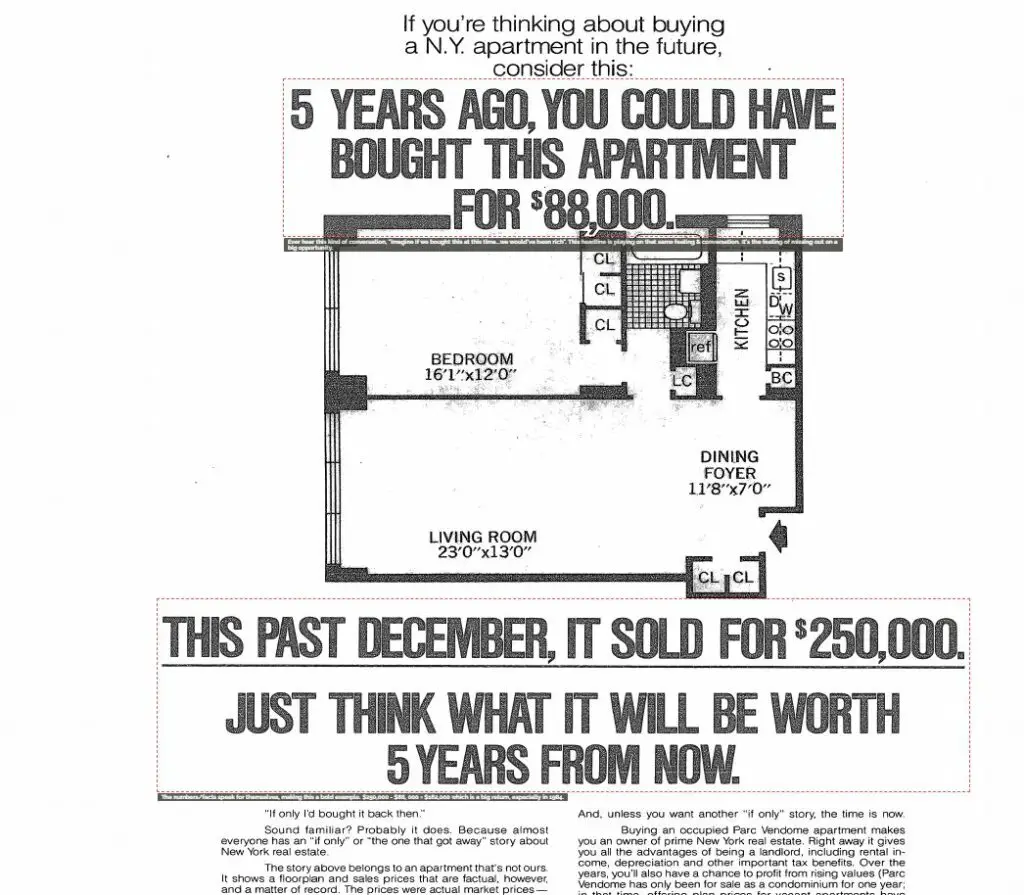
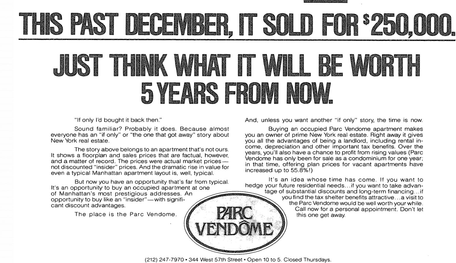
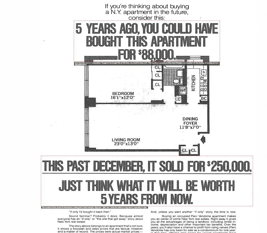
The photo below shows an example I took from the swipe files I regularly get inspiration from for my copywriting work.
It’s from an older ad before the Internet existed.
Because of the age of this advertisement, the call to action was not to fill out a form somewhere but to call a particular number.
The Video Real Estate Landing Page
The characteristic of this landing page isn’t so much the type of content it uses but the format: video.
You have a high degree of freedom about where and how to apply it.
So, you could use video for all the above and the remaining real estate landing page types and examples.
For instance, you could use it to provide valuable information or demonstrate a specific real estate skill or knowledge.
You can complement it with a brief introduction, key takeaways, and a CTA. The latter should encourage viewers to explore further services or products you offer.
Educational content can attract and convert cold or unaware prospects into your real estate funnel.
While it’s not specifically a how-to video landing page, the one Prostream uses is pretty decent.
As you can see below, they use a silent video approach running in the background with a visible call to action to start the free 7-day trial.

And then I also found this one from a pool builder company. I was positively surprised by his approach.
Why?
He uses a short video to anticipate and handle objections from visitors who hesitate to leave their contact information.
But see for yourself:
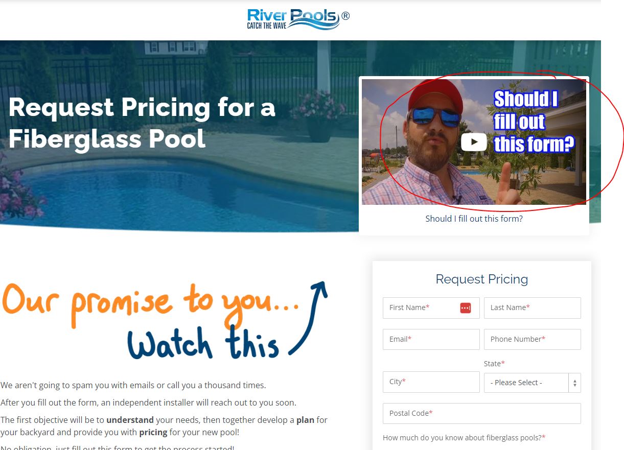
And here, you can watch the video I am referring to.
So, this pool-builder company used video only to handle objections for email subscriptions.
You could do something similar to handle objections of a seller filling out an appointment form.
Or you could create a video version of the sales letter landing page above.
Or how about handling objections a buyer prospect may have about a particular property listing?
You could include this video on the particular listing page.
A Survey/Quiz Landing Page
This real estate landing page is a well-structured survey to gather information from seller or buyer prospects.
It provides the survey results in exchange for contact information.
This page should…
- Be straightforward, with a clear purpose.
- Have engaging questions
- Have a promise of value (like personalized advice or insights).
While it’s useful for gathering data, it might not directly lead to high conversions. This is unless it’s coupled with a strong incentive.
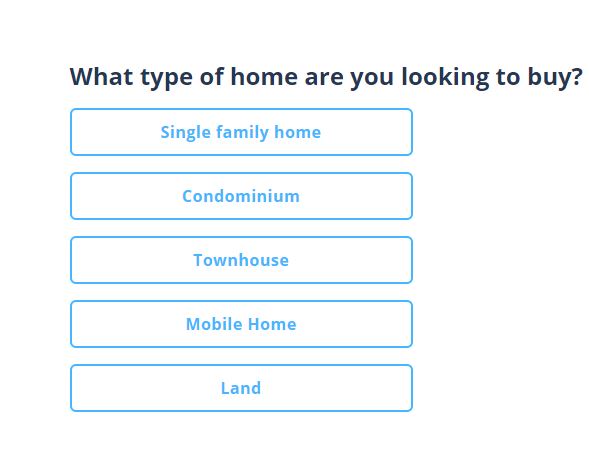
For a real estate landing page, this could be a survey or quiz helping buyers assess the ideal neighborhood to buy.
Based on that, it suggests properties or whether they qualify for a loan.
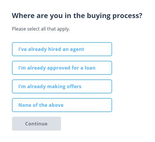
The elements used are small question pages with multiple-choice answers and the opt-in element with the call to action to get results at the end.
The questions should be distributed across multiple steps.
Why?.
No one wants to click a button to start a survey and face five or more questions on a single page.
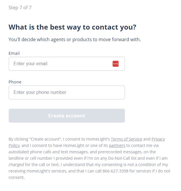
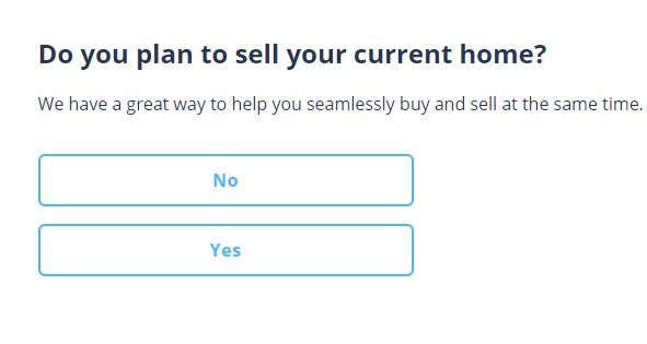
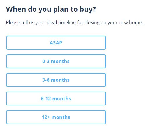
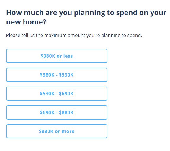
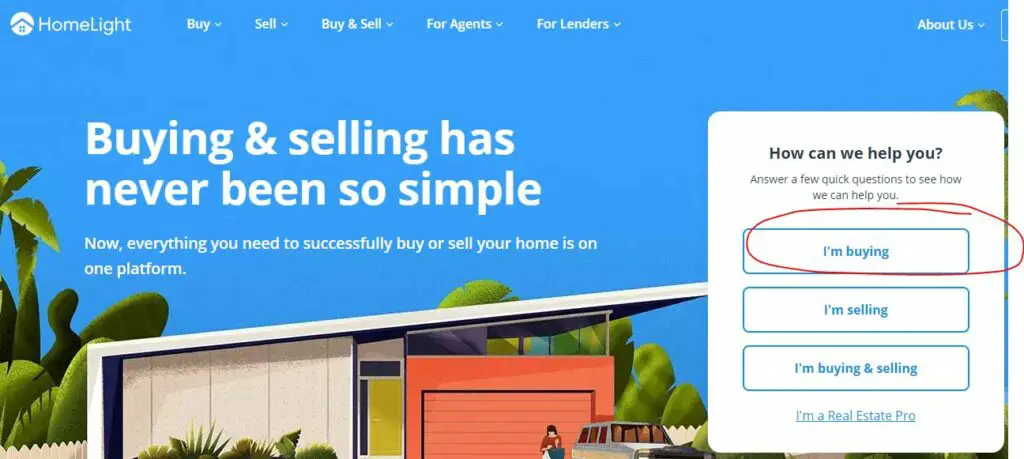
As an example, we can use the company Homelight again.
They use a survey landing page for both buyer and seller lead generation.
I went through the buyer prospect survey, and it has nine questions, including leaving the full name, email, and phone number at the end.
The conversion rate would be pretty bad if you used all these questions on one page.
However, there is one thing I would do differently.
I would mention the benefit of getting tailored property recommendations on the last page.
This is after the prospect leaves their contact information.
If you don’t, it’s more of a multistep opt-in form than a survey landing page.
Application Landing Page
This landing page targets a specific, mostly high-end real estate niche (like luxury home sellers).
It includes an application form to create a sense of exclusivity and urgency.
The latter is the focus element of this type of landing page.
So you can use it wherever you want to create scarcity.
Like the next one, this landing page type is more defined by a sales copy element than a particular real estate landing page structure.
Why?
You can apply scarcity to all the above real estate landing pages.
Just change the wording of the call to action (CTA) and the headline at the beginning.
Instead of the CTA targeting buyer prospects “Schedule an appointment,” it could be “Apply for an Appointment.”
And instead of the headline “Are you looking to buy?” it could be “Wish to qualify for our select high-end properties?”
Launch/Pre-Sell Landing Page
This type of landing page is often used to pre-sell information products or smaller products.
Also, it’s to hype a new product or service before its official launch.
You often find it in the e-commerce space.
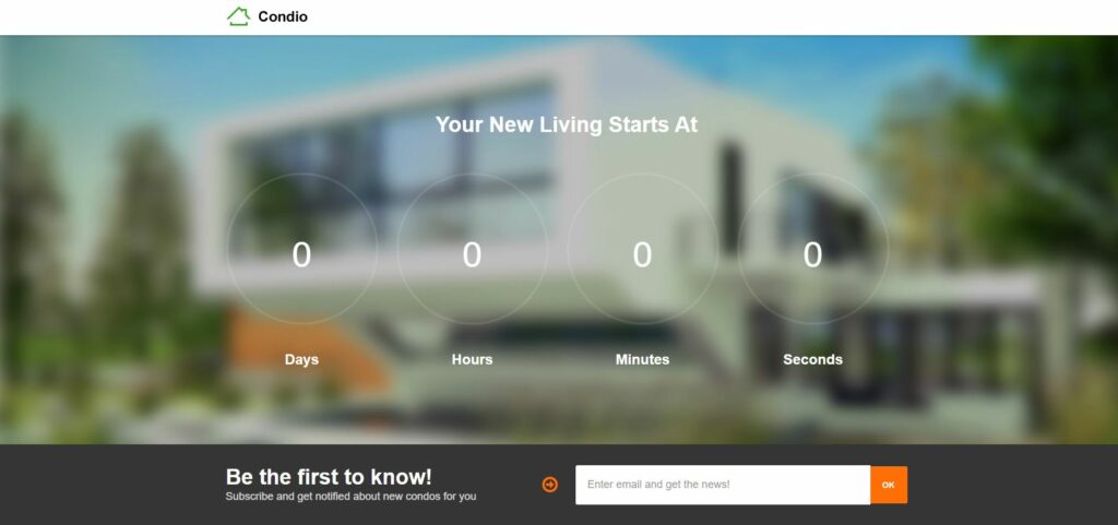
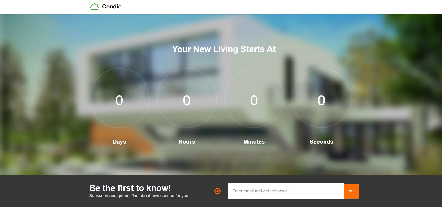
It builds anticipation and often includes a countdown timer and pre-order options.
Like the application landing page, you can use it for almost all the already-mentioned real estate sales pages.
Why?
Again, the main characteristic is the sales copy or persuasive element of creating urgency.
In the example before, the main characteristic was the persuasion element of scarcity.
Can this even be used in real estate?
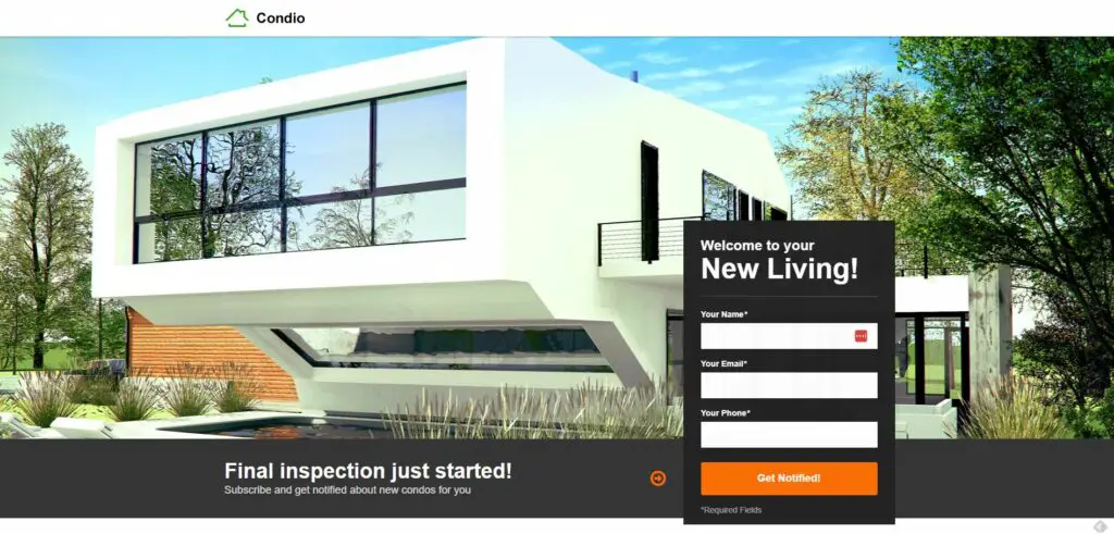
Absolutely. How about using one to pre-sell a new building project?
Well, it wouldn’t be like selling a watch on an e-commerce website, but the call to action could be “Schedule an Appointment” instead of “Add to Cart.”
The use case for this type of landing page is likely more valuable for real estate developers.
Or how about using it to generate buyer leads for an open house?
Below, you can see an example of such a landing page often involving a countdown timer to create more urgency.
This article has been reviewed by our editorial team. It has been approved for publication in accordance with our editorial policy.
- The Surprising Link Between Weight Loss Struggles and Real Estate Lead Gen Success - October 29, 2024
- Performance Risks of “Marketing ROI Black Boxes” for Real Estate and other Industries - October 15, 2024
- What You Don’t Measure in Real Estate Marketing… - October 1, 2024

